This week’s Canada’s Craft Beer post comes from our BC craft beer guy, Bryan Clegg. They say we eat with our eyes first, and in the world of craft beer, it's the label that can entice a consumer to try a new brew. Today Bryan talks to the one of the founders of Hired Guns Creative about their involvement in branding and design in the alcohol industry.
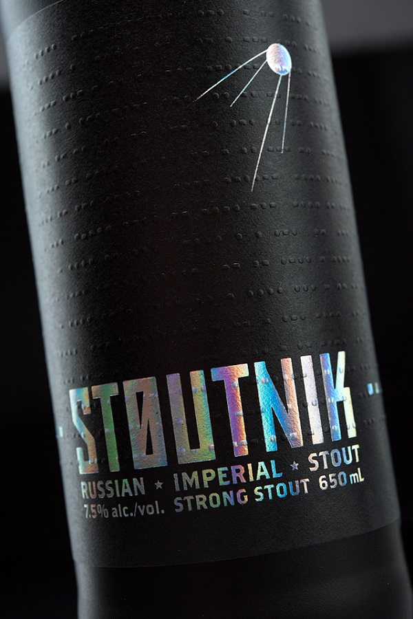
A few years ago I found a bottle of Russian Imperial Stout on the bottom shelf in a store. It was named "Stoutnik" (I adore that name) by a brewery on the island named Longwood. I was immediately drawn to the design. The letters were made of a sort of foil that reflected and changed hues as I moved around it, catching my eye. I picked it up, saw it was a style I like from a brewery I wasn’t familiar with, and put it in my cart.
Would I have noticed it without that label? I doubt it.
Packaging design is hugely important in any industry, and the alcohol business is no exception. As more and more breweries open up, standing out in every way possible has taken on increasing significance.
So who designed that fantastic Stoutnik label? The design firm Hired Guns Creative. Founded in 2008 by Leif Miltenberger and Richard Hatter, Hired Guns has been creating some of the most interesting and innovative labels in the wine/beer/spirits industry. Stoutnik alone won several design awards in 2013/14.
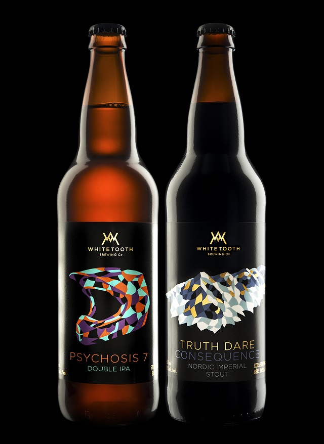
Then one of the largest breweries in BC, Driftwood Brewing, hired them to revamp their lineup. The result — beautiful flowing custom-cut wraparound labels on every bottle — has been nothing short of phenomenal.

I had the opportunity to speak with Leif about their business, inspiration and more.
* * * * *
BC: How did you become involved in branding and design in the alcohol industry? Was it your goal from the beginning or something that happened over time?
LM: For the first couple of years after we started our business (so that would be 2008–2010) we were a generalist designing company: designing anything for anyone. The problem we found with this approach was that we ended up competing on price, which turned out to be a race to the bottom.
We began to look around for areas to specialize in and ended up focusing on the wine industry. Specifically on Island wineries because they were easier to drive to than the Okanagan. After a couple of years of working with wineries (2010–2012) we began to shift over to craft beer and spirits. We found those to be a better creative fit for us. (Wineries tend to be more conservative.) About four years ago we phased out all of our non-alcohol clients and now we’re able to compete on our experience, our expertise, our history of positive results, and the strength of our portfolio.
BC: How do you approach the branding and design language for a brewery/individual beer?
LM: It depends on whether we’re inheriting any existing identity elements (name, branding, product names, etc.). With start-ups we’re usually given a name and a general direction but that’s about it. Sometimes not even that much.
We put all of our clients through an intake process in the beginning of the engagement that’s designed to get everything out of their heads and down onto paper. It’s designed to give us the best possible understanding of what they’re after before we start designing instead of struggling to figure it out during the design process.
We spend a fair bit of time working on the personality of the brand they’re trying to create. We don’t want to design something that doesn’t resonate with the people behind the brand. They’ve got to live it day in and day out so it better be something they can own.
We get our clients to identify who they see as competitors. We stack our designs up against their competitors' to make sure that the labels we’ve designed are standing out from within that set. And we test our designs in retail settings. How do they look in a cooler? On the bottom shelf? Under shitty fluorescent lighting? It’s our job to get someone to purchase a product for the first time so paying attention to the context in which our designs need to perform is paramount.

BC: Where do you draw most of your inspiration? Are there any artists you look up to or styles that get your creative juices flowing?
LM: It’s different for every project. The research phase of each project takes us down a new path every time.
But over the past few years we’ve been making a concerted effort to draw inspiration more from old books instead of Google. It’s hard to stand out if you’re obsessed with the same design blogs as every other designer out there.
BC: What would you say are the biggest differences between designing for wineries, distilleries, and breweries?
LM: In our experience, wineries tend to be the most conservative of the three. And I get it … they’re very dependent on the weather and they get relatively few chances at making great wine. A winemaker gets 20, maybe 25 chances to make a great vintage in his or her lifetime. Contrast this with the amount of time it takes to make a batch of vodka (one week).
Unless they’re growing their own ingredients, breweries and distilleries don’t face the same challenges.
Distilleries get broken down into two categories: those who are making whisk(e)y and those who aren’t. The whisk(e)y folks have a different mindset; they’re in it for the long haul because their products take so long to age. This tends to translate into perfectionist tendencies and the notion that they’d rather get things just right even if it ends up taking a bit longer.
The distillers who don’t make whisk(e)y tend to be more like breweries. They’re keenly aware of the need to compete effectively in the retail environment.
BC: What was your first major project and first craft beer project?
LM: Our first major project … it’s been so long that I can’t even remember.
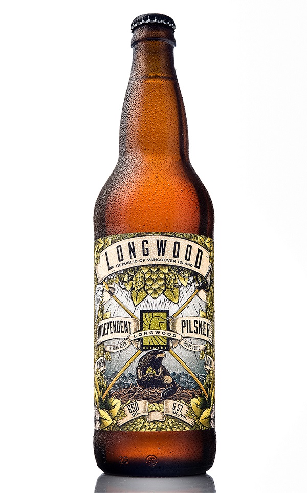
Longwood Brewery here in Nanaimo was our first major craft beer project. We were hired to name their five core beers and create branding and packaging designs for each one.
BC: I remember seeing a bottle of Stoutnik in the store for the first time and thinking, “Damn that looks cool!”. I felt compelled to pick up and explore the bottle. It was the first time I’d really been wowed by the label design of a beer. You also won several awards for that design. What do you think separates it from the pack?
LM: The frosted black bottle and the holographic foil for the STOUTNIK word mark are what really make it stand out. There are very few fully black-on-black beers on the market and the holo-foil changes colour every time you shift your position. The label twinkles at you from the shelf. It’s the closest we’ve ever come to an animated label.
Did you know that there’s a story all about that beer told in blind-embossed morse code on that label? Most people don’t realize it’s there. But the ones who do tend to become hardcore fans once they discover it.
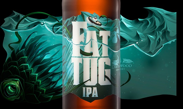
BC: More recently, you’ve been gaining a lot of recognition for your work on Driftwood’s new labels. What has that been like? There are some pretty iconic beers in their portfolio, particularly Fat Tug. Was there any backlash from the changes?
LM: There was definitely some Fat Tug backlash, which we expected. Some people seem to have a hard time separating the way their favourite thing looks from the way it tastes. There were some angry social media comments for a while, but that was the worst of it. Overall, the response to the new labels has been overwhelmingly positive.
BC: In 2016, your studio was hit by a devastating fire, forcing you to relocate and start over, in many ways. People in the community started a crowdfunding campaign to help, and there was even a book drive to replace part of your lost library. What are your main takeaways from that experience?
LM: a) Goodwill:
Before the fire we had never had a reason to try to tap into the goodwill that we’d built up over the years. We just did our own thing and left it at that. The fire showed us just how much goodwill we really had, both from our clients and from the design community. The amount of help and support we received absolutely floored us. And it was needed. Without it, we probably wouldn’t have recovered from the fire.
b) Strength of our team:
We were impressed with the strength of our team. While I’m sure they were worried about their job security, they all rallied behind us and helped with the rebuilding process in many different ways. There were days in the month right after the fire where their positive attitudes kept us going. I remember our project manager turned to me as we were watching the studio burn down and said, “OK, where are we moving to next?”.
c) Automated offsite back-ups are essential:
We use a system called Backblaze to back up all our data automatically every night to the cloud. Instead of losing eight years of work, we lost one day’s worth of work. Anyone who works with computer on a daily basis should have a system like this in place. Set it up, forget it, hopefully you’ll never need it it. But if you ever do, it’ll be worth every penny. New office space, new computers … we were back up and running in 10 days.
d) Insurance companies are bastards:
We’re still fighting to get our full claim paid out and 15 months later. I’m starting to think Lloyds of London doesn’t really exist.
BC: What designs are you the most proud of? And which were the most difficult to create?
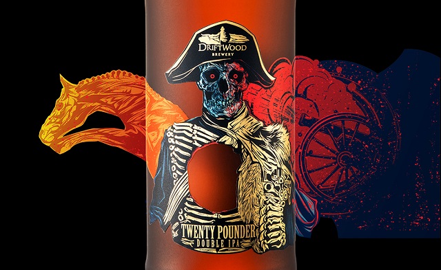
LM: Tough question! We’ve always been really partial to the Twenty Pounder design (Driftwood’s double IPA).
The most difficult? That’s another tough question. Sometimes it’s difficult to arrive at a solid concept. Sometimes the client is difficult to work with. Sometimes the deadlines are punishing.
Sadly, the most difficult project we’ve done is one that ended up on the cutting room floor, where no one will ever see it.
* * * * *
Huge thanks to Lief for taking the time to answer my questions!
STILL THIRSTY?
Check out all our Canada’s Craft Beer articles.
Todd covers Atlantic Craft Beer
David covers Ontario and Quebec Craft Beer
Bryan covers BC Craft Beer
Bryan Clegg is the beer columnist for VanFoodies.com. Bryan has a wide and accommodating palate; whether it’s a tasty low-IBU ale or a ride on the IBU train to Hop Country, he’s happy to drink and share a story about the ride. Follow @vanfoodies on Twitter, Instagram or Facebook.
You can unsubscribe any time!


Leave a Reply